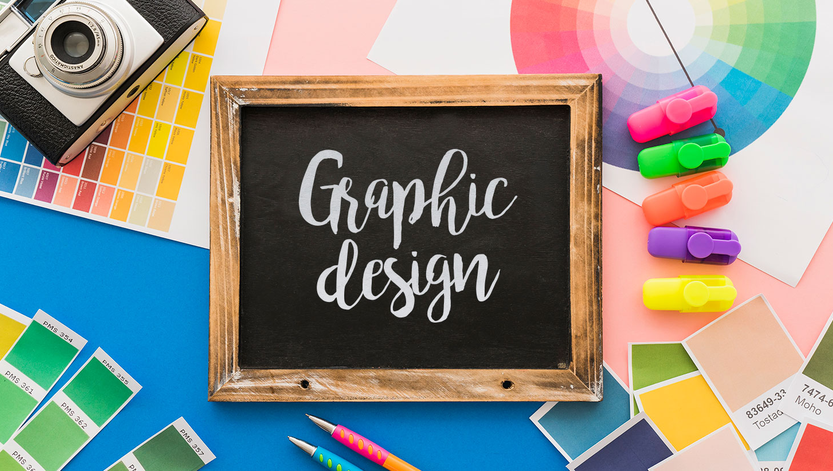
A graphic design has an important role in supporting the success of a content marketing. Because, however, before consumers read further about the content, the first thing they see is the design.
If the company is able to display an attractive graphic design, then consumers will certainly be interested in knowing more about the content they want to present. Unfortunately, there are still many companies or business actors who do not pay attention to the importance of graphic design in content.
Using too much color
Avoid solid colored backgrounds behind text. Excessive use of color will annoy the reader. This is because bright colors can make text that is close together more difficult to read than black text on a plain white background.
Not creating page numbers
Page numbers are important to readers because they help them to see the order in the publication. In addition, not a few readers rely on page numbers to refer back to previously read information.
Long line
Many white papers are difficult to read because the text extends in an unbroken line across the page, from the left margin to the right margin. But long lines are kind of hard and tiring to read. A lot of white space is needed along the edges of the page that can rest the reader’s eyes so they are not too tired after reading texts that are close together.
Using the wrong typeface
There are three main classifications of fonts: decorative, serif, and sans serif. Decorative fonts like Constantia or Broadway are very stylish and are great for attracting attention or projecting an atmosphere or image. This use of typography should be limited to logos and packaging, where images are more important than text.
Serif fonts like Times New Roman and Garamond are ideal for content that needs to be read longer. Serif fonts will help define the unique shape of each letter and direct the reader’s eye from letter to letter.
Sans serif fonts like Arial and Verdana are very easy to read. Its clean and simple design helps readers recognize words from a distance, which is why they are used for highway signage. Sans serif typography is often used for headlines and subtitles.
Wrong font size
When the font size is made too large, at 14 points for example, then we cannot enter enough words in each line to make the reader more comfortable. Letters that are made too small will also tire the eyes because they have to move left and right on each line, causing the eyes to strain. The most popular and easy-to-read type size is 12 points.
The need for digital IT is needed in daily activities, Bead IT Consultant is the right choice as your partner, visit our website by clicking this link: www.beadgroup.com