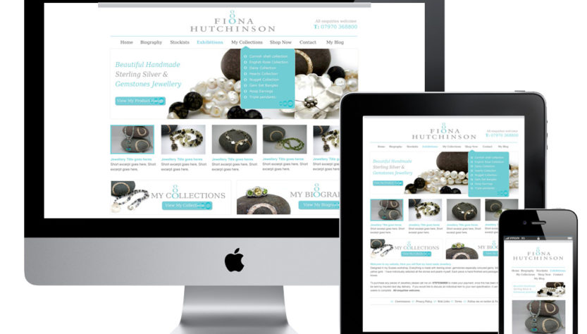
Responsive Web Design is a technique used to make website layouts adapt to the appearance of visitors’ devices, both in size and orientation. So the display that is on the computer desktop with the view that is accessed via a SmartPhone, for example, will have a different appearance. Responsive Web Design To test the display using the Responsive technique, you don’t have to access it via a mobile device or other device, but simply by minimizing the browser to the desired mobile device size, we can already see the appearance of our website on the mobile device screen.
STRENGTHS AND WEAKNESSES
This technique has begun to be widely used among external and local web designers and has several advantages, one of which is saving the use of sub domains, which previously had to use the word “mobile” or “m” in front of the domain, now it is enough to just type the domain name and The display will adjust to the device used. The main advantage, of course, is that it can reduce the number of developments to just one for all devices to use. Then the weakness of this technique is if it is used on websites that aim to display images only, such as photography websites for example. The image resource loaded by our device will be the same as that loaded on our computer. For that we need to pay attention to whether the website that we create is suitable for using this Responsive technique.
HOW TO USE?
This technique is the same as we make designs with HTML and CSS. But after finishing creating the display for the desktop, we have to create a CSS file for other devices. For the second CSS file, the creation will be slightly different from the first CSS, because there is a special trick, namely the Media Queries Boilerplate, which is used to detect the device screen. The following code is used to detect the screen of the device used:
*Smartphones (portrait and landscape) ———– */
@media only screen
and (min-width : 320px)
and (max-width : 480px)
{ /* Styles */ }
/* Smartphones (landscape) ———– */
@media only screen
and (min-width : 321px)
{ /* Styles */ }
/* Smartphones (portrait) ———– */
@media only screen
and (max-width : 320px)
{ /* Styles */ }
/* iPads (portrait and landscape) ———– */
@media only screen
and (min-width : 768px)
and (max-width : 1024px)
{ /* Styles */ }
/* iPads (landscape) ———– */
@media only screen
and (min-width : 768px)
and (max-width : 1024px)
and (orientation : landscape)
{ /* Styles */ }
/* iPads (portrait) ———– */
@media only screen
and (min-width : 768px)
and (max-width : 1024px)
and (orientation : portrait)
{ /* Styles */ }
/* Desktops and laptops ———– */
@media only screen
and (min-width : 1224px)
{ /* Styles */ }
/* Large screens ———– */
@media only screen
and (min-width : 1824px)
{ /* Styles */ }
/* iPhone 4 ———– */
@media
only screen and (-webkit-min-device-pixel-ratio : 1.5),
only screen and (min-device-pixel-ratio : 1.5)
{ /* Styles */ }
Now, just adjust it to our needs, don’t you want to make it on the screen with which size.
CONCLUSION
Responsive techniques are good for optimizing the layout of a website. However, its use must also be adjusted to the type of website itself, whether it will be “suitable” if this technique is used on the website. For websites that aim only to display images such as photography websites, it’s better to make the mobile version only, so it doesn’t take up too many resources. That’s a short tutorial about Responsive Web Design, hopefully it’s useful.
The need for digital IT is needed in daily activities, Bead IT Consultant is the right choice as your partner, visit our website by clicking this link: www.beadgroup.com