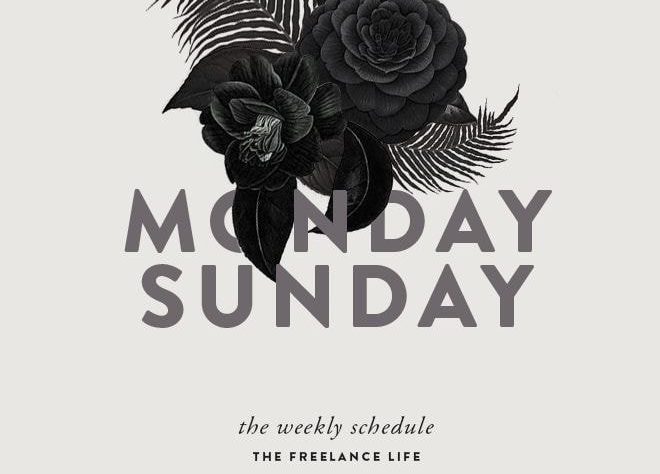
Black and white can seem like a very inflexible palette, but believe me, if I tell you, it’s actually quite the opposite. In fact, black and white is a combination that is as versatile, easy to use, and effective as any other color!
In this list, we’re going to take a look at 50 stunning monochromatic designs and hopefully you’ll quickly realize how versatile this little palette really is, and how easy it is for you to get started with your own black and white designs. So, let’s get started.
Creating Striking Custom Types
This film poster by Kyle Kim blurs the line between illustration and type by creating a striking title out of a sharp black bird silhouette, contrasted against a white background to form a title type. The use of clustered elements and a radial composition will draw attention to the title and then out onto the information on the exterior, making this monochromatic design not only cool and clever but also functional.
- Generate Movement With Bold Lines
Describing a stationary object as doing a lot of ‘movement’ can sound weird, but take a look at this design from Paperjam and notice how it uses bold, curved lines to create a moving and immersive feeling. By overlapping the type with the graphic outline, this section creates the illusion of type being sucked into the design, giving the whole effect a very immersive look. - Creating Elegant Illustrations – Pattern-based
We tend to think of patterns as colorful, geometric things, but look at this monochromatic design by Pharaoh which instead uses elegant and detailed illustrations to form a branded pattern. The combination of mysterious, eye-catching elements and a sharp black and white palette make this branding kit both effective and striking. - Increase Contrast
This 1993 poster by Armin Hofmann enhances the contrast of the image to bring out the lighter tones of the image, which helps to highlight the shape and curves of the image. These highlighted curves also contrast with the sharp graphics that resemble the shape of the photo and help to sharpen the image and give it a new layer of meaning. - Combining Images and Types Naturally
This poster design by Atelier Martino & Jaña combines type and image in a fluid and natural way, utilizing the curves and contours of the image. Using custom handwritten type and an elegant monochromatic watercolor effect to complement the focus image, this design flows beautifully from one element to another, creating a classy and sophisticated design.

