Typography is defined as an art as well as a technique of selecting and arranging letters to create a certain impression. The arrangement and distribution of letters according to the available space is considered to be able to increase the maximum reading comfort.
The type of typography used will help a graphic designer convey his ideas effectively to the audience. The art of lettering or type design is one of the elements that must be mastered so that the work produced can make the audience understand the message it has initiated.
Some typographic literature groups the form of letters in several classifications, characteristics, functions, and early appearances. In general, the following types of typography are widely used today.
1. Serif
This is the most classic typeface. So named because of the presence of serifs or thin lines resembling fins on the arms or ends of the letters’ legs. Romance and Bodoni font styles are serif types. When reading this series of letters, it gives off an impression of flexibility and classic.
In roman letters, the difference in thickness is not very visible. This makes this group have high legibility, so it is often used as a formal text. For example, Garamond, Baskerville, and Times New Roman.
Meanwhile, bodoni letters have a more assertive characteristic of thickness and thinness. Significant differences arise in order to distinguish the links and stems of letters. For example, Modern Craw, Bodoni, Normandy, and Alexuss Heavy.
2. Egyptian
Still included in the serif group, only the shape tends to be large. Also known as slab serif, this typeface is usually used to emphasize and emphasize a word or message. So, the impression of being solid, strong, and stable appears when you see a row of Egyptian letters.
Most of these fonts are used in the field of advertising design because they can attract attention through their large size and bold appearance. Egyptian is commonly used in titles, logos, and headers. For example, Serifa, Rockwell, Memphis, and Aachen.
3. Sans Serif
The word “sans” means without, so sans serif indicates the absence of a serif form in a letter. Appeared in the mid-19th century, this type appears simple and has fast readability. The simple, clean, efficient, and modern impression makes it familiar in various visuals that you encounter everyday. Almost all digital screen interfaces use sans serif, including when writing long paragraphs of text.
This typography is a modern form of Romance. Some examples of well-known sans serif groups include, Arial, Helvetica, Lucida Sans, Gill Sans, and Futura.
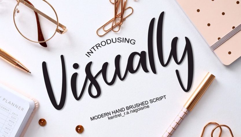
4. Script
This typography resembles traditional handwriting to get a more aesthetic impression of a visual work. However, because it is shaped like a continuous vertical letter with slight variations in thickness in each letter, the script must be used with caution.
The handwritten type is not the ideal typeface for long writing. You can use it as a short text. For example, the title on the Certificate by writing a combination of the first letters of capital and lowercase for the rest. Often synonymous with the impression of luxury, script writing also creates a familiar and more personal impression. Included in the script are Mistral, Monotype, Brush Script, and Edwardian Script.
5. Decorative
The development of decorative typefaces tends to vary, thus making the variations of the letters so many and different from one another. A certain impression can be captured by readers when they see this decorative styled lettering.
Also known as display fonts or ornamental fonts, these fonts are highly ornamental. Suitable for use as a tagline or title. However, this makes this font unsuitable for use as a body of text because it makes it difficult to read. Examples of decorative types are the Walt Disney, Birthday Font, and Inspira Font.
6. Miscellanous
In the form of development of various types of letters that have existed before. The addition of embellishments, ornaments, or decorative lines makes this category often called fantasy fonts.
Usually, miscellanous is used in designs that prioritize the element of imagination. Commonly used in comic texts and products with the target market of children. Thanks to its unique and cute shape, this typeface easily grabs the attention of anyone who sees it. For example, Magneto, Westminster, Joker, and Comic Sans MS.
When a graphic designer neglects the elements of typography, the risk is that the design work is less communicative. In order to avoid that from happening, of course, you have to learn different types of typography in order to be able to create designs that are both effective and easy to read. Those are 6 Types of Typography that are often used for design needs. Hopefully this article can provide information that is accurate, reliable and can be used for teaching and learning needs. Good luck and happy working with various typography!
The need for digital IT is needed in daily activities, Bead IT Consultant is the right choice as your partner, visit our website by clicking this link: www.beadgroup.com