Understanding Flexbox
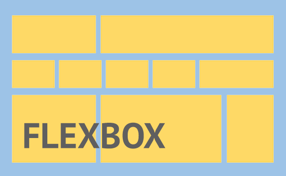
Flexbox is a layout mode that exists in CSS3 and is used to organize elements on a web page. This Flexbox will adjust the size of its child elements automatically, and is able to adapt to the size of its container. Whello also uses this Flexbox in website creation services for clients if needed, depending on the type of website to be created.
Flexbox Function
The purpose of flexbox is to give containers the ability to adjust the length, width, and position of the items in it to maximize the available space. This setting is very important for a frontend developer to create a website that is comfortable to view on various devices with various resolutions. What are the properties of Flexbox containers?
flex-directionflex-wrapflex-flowjustify-contentalign-itemsalign-content
- flex-direction
Specifies the direction (direction) that will be applied to the items in the flexbox container. The direction in question is whether you want to line up/horizontally (from left to right or vice versa) or like a column/vertical (from top to bottom or vice versa).
.container { flex-direction: column; } /* Pilihan valuenya ada: row | row-reserve | column | column-reserve */
- flex-wrap
flex-wrap is used to define that item elements inside a flexbox container do not have to be aligned on a single line. That is, the element of the item is rolled (moved) to a new line when it meets the width of its container.
.container { flex-wrap: wrap; } /* Pilihan valuenya ada: nowrap | wrap | wrap-reserve */
- flex-wrap
flex-wrap is used to define that item elements inside a flexbox container do not have to be aligned on a single line. That is, the element of the item is rolled (moved) to a new line when it meets the width of its container.
.container { flex-flow: row wrap; } /* Penjelasannya: <flex-direction> spasi <flex-wrap> */
- justify-content
justify-content is used to align items between flexboxes so that the flexbox container can distribute the remaining free space when the flex items in one line are not flexible or even though they are flexible but have reached the maximum size limit.
.container { justify-content: space-arround; } /* Pilihan valuenya ada: flex-start | flex-end | center | space-between | space-arround | baseline */
- align-items
align-items defines how the items in the flex container are placed along a perpendicular line to the main axis (cross-axis). This is the same as justify-content but the placement is different.
.container { align-items: flex-end; } /* Pilihan valuenya ada: flex-start | flex-end | center | baseline | stretch*/
- align-content
align-content is used to align the flex container line when there is free space in a perpendicular line to the main axis (cross-axis). Similarly, justify-content aligns individual items on the main axis.
Please note: This property cannot be applied if there is only one flex item.
.container { justify-content: space-arround; } /* Pilihan valuenya ada: flex-start | flex-end | center | space-between | space-arround | baseline
The need for digital IT is needed in daily activities, Bead IT Consultant is the right choice as your partner, visit our website by clicking this link: www.beadgroup.com