tutorial Creating a Blogspot Blogger Template – In a year that is increasingly developing as it is today, have you Bloggers, especially those using the Blogspot platform, able to create their own templates? Being able to create Blogger templates is a matter of pride, we can be creative in making various kinds of templates as we wish or just modifying existing templates to suit our tastes.
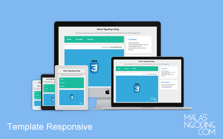
HTML5 responsive blogger template
If you already understand HTML, CSS and the basics of Javascript, then creating a blogger template is no longer a difficult thing to do, because basically a blogger template consists of an arrangement of HTML and CSS tags inserted with special XML tags from Blogger. These Blogger tags are pattern in nature and cannot be changed, so to use them, we have to memorize their functions. Don’t worry, Blogger tags are not programming languages that require extra reasoning to understand them, Blogger tags are very easy to master for anyone.
Before practicing making blogger templates, it’s good to know in advance what are the functions of the blogger tags? As with PHP programming, if you have heard of MySQL data communication with PHP, it is not much different from the Blogger tag whose function is as a communication language to the Blogger database server so that post data can be displayed on web pages, save page settings (Page) , save widget settings, display post time, display author, etc.
For this reason, the main requirement for anyone who wants to be able to create their own Blogger template is to first master HTML, CSS and the basics of Javascript. It doesn’t have to be hard, you just need to understand the basics so that you will gradually get used to it. In order not to be lengthy and too long, here I choose a ready-made regular HTML5 template, this template is free as learning material from 1stwebdesigner, here we are only trying to convert or turn it into a Blogger compatible template. Download the basic template and see the demo.
How to Create Blogger Templates
Notice, below is the HTML5 template code originally. Please copy and paste in Notepad++ or your favorite other editor. Save with .html extension:
<!DOCTYPE html>
<html lang=”en”>
<head>
<title> 1WD HTML5 theme </title>
<meta charset=”utf-8″ />
<link rel=”stylesheet” href=”style.css” type=”text/css” />
<meta name=”viewport” content=”width=device-width, initial-scale=1.0″> </head>
<body class=”body”>
<header class=”mainHeader”> <img src=”img/logo.gif”>
<nav>
<ul>
<li class=”active”> <a href=”#”> Home </a> </li>
<li> <a href=”#”> Portfolio </a> </li>
<li> <a href=”#”> Blog </a> </li>
<li> <a href=”#”> Contact </a> </li>
</ul>
</nav>
</header>
<div class=”mainContent”>
<div class=”content”>
<article class=”topcontent”>
<header>
<h2> <a href=”#” rel=”bookmark” title=”Permalink to this POST TITLE”> Second article </a> </h2> </header>
<footer>
<p class=”post-info”> This was posted on the 2nd of March 2013 by Christian Vasile </p>
</footer>
<content>
<p> Lorem ipsum dolor sit amet, consectetur adipisicing elit, sed do eiusmod tempor incididunt ut labore et dolore magna aliqua. Ut enim ad minim veniam, quis nostrud exercitation ullamco laboris nisi ut aliquip ex ea commodo consequat. Duis aute irure dolor in reprehenderit in voluptate velit esse cillum dolore eu fugiat nulla pariatur. </p>
<p> At vero eos et accusamus et iusto odio dignissimos ducimus qui blanditiis praesentium voluptatum deleniti atque corrupti quos dolores et quas molestias excepturi sint occaecati cupiditate non provident, similique sunt in culpa qui officia deserunt mollitia animi, id est laborum et dolorum fuga. Et harum quidem rerum facilis est et expedita distinctio. </p>
</content>
</article>
<article class=”bottomcontent”>
<header>
<h2> <a href=”#” rel=”bookmark” title=”Permalink to this POST TITLE”> First post </a> </h2> </header>
<footer>
<p class=”post-info”> This was posted on the 5th of March 2013 by Christian Vasile </p>
</footer>
<content>
<p> Lorem ipsum dolor sit amet, consectetur adipisicing elit, sed do eiusmod tempor incididunt ut labore et dolore magna aliqua. Ut enim ad minim veniam, quis nostrud exercitation ullamco laboris nisi ut aliquip ex ea commodo consequat. Duis aute irure dolor in reprehenderit in voluptate velit esse cillum dolore eu fugiat nulla pariatur. Duis aute irure dolor in reprehenderit in voluptate velit esse cillum dolore eu fugiat nulla pariatur. </p>
</content>
</article>
</div>
<aside class=”top-sidebar”>
<article>
<h2> Top Sidebar </h2>
<p> Discover how to use new techniques to achieve an outstanding, cross-browser HTML5. </p>
</article>
</aside>
<aside class=”middle-sidebar”>
<article>
<h2> Middle Sidebar </h2>
<p> Lorem ipsum dolor sit amet, consectetur adipisicing elit, sed do eiusmod tempor incididunt ut labore et dolore magna aliqua. </p>
</article>
</aside>
<aside class=”bottom-sidebar”>
<article>
<h2> Bottom Sidebar </h2>
<p> Lorem ipsum dolor sit amet, consectetur adipisicing elit, sed do eiusmod expedita distinctio. </p>
</article>
</aside>
</div>
<footer class=”mainFooter”>
<p> Copyright © 2013 <a href=”https://www.androphedia.com”> 1stwebdesigner </a> </p>
</footer>
</body>
</html>
HTML5 Hold it, before it’s modified
We copy paste the style.css file into a single html file and below is the modified HTML5 template above:
<?xml version=”1.0″ encoding=”UTF-8″ ?>
<!DOCTYPE html>
<html b:version=’2′ class=’v2′ expr:dir=’data:blog.languageDirection’ xmlns=’https://www.w3.org/1999/xhtml’ xmlns:b=’https://www.google.com/2005/gml/b’ xmlns:data=’https://www.google.com/2005/gml/data’ xmlns:expr=’https://www.google.com/2005/gml/expr’>
<head> <title><data:blog.pageTitle/></title> <meta content=’width=device-width,initial scale=1,minimum-scale=1,maximum-scale=1′ name=’viewport’/> <meta content=’text/html;charset=UTF-8′ http-equiv=’Content-Type’/> <meta content=’IE=edge,chrome=1′ http-equiv=’X-UA-Compatible’/> <b:include data=’blog’ name=’all-head-content’/> <b:skin><![CDATA[
/* ———————————————– Blogger Template Style Name: Template Wussh… Designer: Syafaatfm URL: www.facebook.com/syafaatfm ———————————————– / / =========================== ======= Body style ======== =========================== / body { background: #E0E0E0; color: #000305; font-size: 87.5%; / Base font size: 14px / font-family: ‘Trebuchet MS’, Trebuchet, ‘Lucida Sans Unicode’, ‘Lucida Grande’, ‘Lucida Sans’, Arial, sans-serif; line-height: 1.429; margin: 0; padding: 0; text-align: left; } .body { clear: both; margin: 0 auto; width: 70%; } / =========================== ========= Headings ======== =========================== / h2 { font-size: 1.571em } / 22px / h3 { font-size: 1.429em } / 20px / h4 { font-size: 1.286em } / 18px / h5 { font-size: 1.143em } / 16px / h6 { font-size: 1em } / 14px / h2, h3, h4, h5, h6 { font-weight: 400; line-height: 1.1; margin-bottom: .8em; } .Header h1 { padding: -9999px 0; } / =========================== ======= Anchor style ====== =========================== / a { outline: 0; } a img { border: 0px; text-decoration: none; } a:link, a:visited { color: #CF5C3F; padding: 0 1px; text-decoration: none; } a:hover, a:active { background-color: #CF5C3F; color: #fff; text-decoration: none; } / =========================== ===== Main Navigation ===== =========================== / .mainHeader nav { background: #666; font-size: 1.143em; height: 40px; line-height: 30px; margin: 0 auto 30px auto; text-align: center; border-radius: 5px; -moz-border-radius: 5px; -webkit-border-radius: 5px; } .mainHeader nav ul { list-style: none; margin: 0 auto; } .mainHeader nav ul li { float: left; display: inline; } .mainHeader nav a:link, .mainHeader nav a:visited { color: #fff; display: inline-block; height: 30px; padding: 5px 23px; text-decoration: none; } .mainHeader nav a:hover, .mainHeader nav a:active, .mainHeader nav .active a:link, .mainHeader nav .active a:visited { background: #CF5C3F; color: #fff; text-shadow: none !important; } .mainHeader nav li a { border-radius: 5px; -moz-border-radius: 5px; -webkit-border-radius: 5px; } .mainHeader img { width: 30%; height: auto; margin: 3% 0; } / =========================== ======= Content Area ====== =========================== / .mainContent { overflow: hidden; line-height: 25px; border-radius: 5px; -moz-border-radius: 5px; -webkit-border-radius: 5px; } .topcontent { background-color: #FFF; border-radius: 5px; -moz-border-radius: 5px; -webkit-border-radius: 5px; padding: 3% 5%; margin-bottom: 3%; } .bottomcontent { background-color: #FFF; border-radius: 5px; -moz-border-radius: 5px; -webkit-border-radius: 5px; padding: 3% 5%; } .content { width: 68%; float: left; border-radius: 5px; -moz-border-radius: 5px; -webkit-border-radius: 5px; } .post-info { font-style: italic; color: #999; font-size: 85%; } / =========================== ======== Sidebar ========== =========================== / .top-sidebar { width: 24%; float: left; margin-left: 2%; border-radius: 5px; -moz-border-radius: 5px; -webkit-border-radius: 5px; background-color: #FFF; padding: 2% 3%; margin-bottom: 2%; } .middle-sidebar { width: 24%; float: left; margin-left: 2%; border-radius: 5px; -moz-border-radius: 5px; -webkit-border-radius: 5px; background-color: #FFF; padding: 2% 3%; margin-bottom: 2%; } .bottom-sidebar { width: 24%; float: left; margin-left: 2%; border-radius: 5px; -moz-border-radius: 5px; -webkit-border-radius: 5px; background-color: #FFF; padding: 2% 3%; } / =========================== ========= Footer ========== =========================== / .mainFooter { width: 100%; float: left; margin-top: 2%; margin-bottom: 2%; padding-left: 0; background-color: #666; border-radius: 5px; -moz-border-radius: 5px; -webkit-border-radius: 5px; color: #FFF; } .mainFooter p { width: 91%; margin: 2% auto; } / =========================== ====== Media Queries ====== =========================== */
@media only screen and (min-width: 150px) and (max-width: 780px) {
.body {
clear: both;
margin: 0 auto;
width: 90%;
font-size: 90%;
}
.mainHeader nav {
background: #666;
font-size: 1.143em;
height: 160px;
line-height: 30px;
margin-bottom: 0;
border-radius: 5px;
-moz-border-radius: 5px;
-webkit-border-radius: 5px;
}
.mainHeader nav ul {
list-style: none;
margin: 0 auto;
padding-left: 0;
}
.mainHeader nav li {
margin-left: 0 auto;
width: 100%;
}
.mainHeader nav a:link,
.mainHeader nav a:visited {
color: #FFF;
display: block;
height: 30px;
padding: 5px 0;
text-decoration: none;
}
.mainHeader nav a:active,
.mainHeader nav .active a:link,
.mainHeader nav .active a:visited {
background: #CF5C3F;
color: #fff;
text-shadow: none !important;
}
.mainHeader nav li a {
border-radius: 5px;
-moz-border-radius: 5px;
-webkit-border-radius: 5px;
border-radius: 5px;
-moz-border-radius: 5px;
-webkit-border-radius: 5px;
}
.mainHeader img {
width: 100%;
height: auto;
margin-bottom: 3%;
}
.mainContent {
overflow: hidden;
line-height: 25px;
border-radius: 5px;
-moz-border-radius: 5px;
-webkit-border-radius: 5px;
margin-top: 4%;
margin-bottom: 2%;
}
.topcontent {
background-color: #FFF;
border-radius: 5px;
-moz-border-radius: 5px;
-webkit-border-radius: 5px;
padding: 2% 5%;
margin-bottom: 4%;
}
.bottomcontent {
background-color: #FFF;
border-radius: 5px;
-moz-border-radius: 5px;
-webkit-border-radius: 5px;
padding: 2% 5%;
}
.content {
width: 100%;
float: left;
border-radius: 5px;
-moz-border-radius: 5px;
-webkit-border-radius: 5px;
}
.post-info {
display: none;
}
.top-sidebar {
width: 86%;
float: left;
border-radius: 5px;
-moz-border-radius: 5px;
-webkit-border-radius: 5px;
background-color: #FFF;
margin-top: 4%;
margin-left: 0;
padding: 0 7%;
margin-bottom: 0;
}
.top-sidebar p {
width: 90%;
}
.middle-sidebar {
width: 86%;
float: left;
border-radius: 5px;
-moz-border-radius: 5px;
-webkit-border-radius: 5px;
background-color: #FFF;
margin-top: 4%;
margin-left: 0;
padding: 0 7%;
margin-bottom: 0;
}
.middle-sidebar p {
width: 90%;
}
.bottom-sidebar {
width: 86%;
float: left;
border-radius: 5px;
-moz-border-radius: 5px;
-webkit-border-radius: 5px;
background-color: #FFF;
margin-top: 4%;
margin-left: 0%;
padding: 0 7%;
margin-bottom: 1%;
}
.bottom-sidebar p {
width: 90%;
}
.mainFooter {
width: 100%;
float: left;
margin: 2% 0;
padding-left: 0;
background-color: #666;
border-radius: 5px;
-moz-border-radius: 5px;
-webkit-border-radius: 5px;
color: #FFF;
}
.mainFooter p {
width: 86%;
margin: 2% auto;
}
}
]]></b:skin> </head> <body class=’body’> <b:section class=’header’ id=’header’ maxwidgets=’1′ showaddelement=’no’> <b:widget id=’Header1′ locked=’true’ title=’Cara Download Premium – Free And Premium Tutorial (Header)’ type=’Header’ /> </b:section> <header class=’mainHeader’> <nav><ul> <li class=’active’><a href=’#’>Home</a></li> <li><a href=’#’>Portfolio</a></li> <li><a href=’#’>Blog</a></li> <li><a href=’#’>Contact</a></li> </ul></nav> </header> <!– content wrapper start –> <div class=’mainContent’> <!– post wrapper start –> <div class=’content’> <article class=’topcontent’> <content> <b:section class=’main’ id=’main’ showaddelement=’no’> <b:widget id=’Blog1′ locked=’true’ title=’Posting Blog’ type=’Blog’ /> </b:section> </content> </article> </div> <!– post wrapper end –> <!– post wrapper start –> <aside class=’top-sidebar’> <article> <b:section class=’sidebar’ id=’sidebar’ preferred=’yes’/> </article> </aside> <!– post wrapper end –> </div> <!– content wrapper end –> <div class=’clear’/> <footer class=’mainFooter’> <p>Copyright © 2013 <a href=’https://www.androphedia.com’>1stwebdesigner</a></p> </footer> </body> </html>
The HTML5 script has been converted into a valid blogger template.
Save the template above with the extension up.xml, then upload it to your Blogger dashboard to see the results.
You just need to learn the difference between the two HTML scripts above, copy and copy them to Notepad++ so that it looks clearer. Nothing has been changed, only a few Blogger tags have been inserted to match the allowed standard templates
Blogger Tag Function Explanation
Section <b:section class=’header’ id=’header’ maxwidgets=’1′ showaddelement=’no’>
In creating a blogger template, Section is a section that serves to retrieve data from the Blogger database.
class = CSS class functions will be applied in this section, can be modified at will.
id = id css.
maxwidgets = The number of widgets allowed in this section.
showaddelement = yes or no, to display “Add a Gadget” on the Layout page.
Widget <b:widget id=’Header1’locked=’true’ title=’Judulnya Blog’ type=’Header’ />
id = optional, serves to give a name to the widget, the name of the widget must be unique and cannot be the same as the others.
locked = true or false, if set to true then the widget cannot be deleted on the layout page and vice versa.
title =optional, if not set then blogger will set it automatically.
type = It is important to determine what type of widget you want to create, for example: for a header the widget type is Header , for displaying posts the widget type is Blog , for HTML/Javascript the widget type is HTML.
The need for digital IT is needed in daily activities, Bead IT Consultant is the right choice as your partner, visit our website by clicking this link: www.beadgroup.com