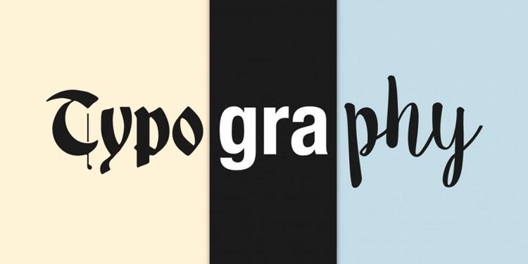
Typography is an art and technique of selecting and arranging letters by adjusting their distribution in the available space, to create a certain impression, for maximum reading comfort.
History of Typography
The history of the development of typography begins with the use of the pictograph. This form of language was used, among other things, by the Norwegian Vikings and the Sioux Indians. In Egypt developed the Hieratic typeface, known as Hieroglyphs around the 1300 BC century. This typographical form is at the root of the Demotia form, which began to be written using special pens.
This typographic form eventually developed as far as Crete, then spread to Greece and finally spread throughout Europe. The peak of the development of typography, occurred approximately in the 8th century BC in Rome when the Romans began to form their power. Since the Romans did not have their own writing system, they studied the writing system of the Etruscans who were native to Italy and refined it to form Roman letters.
The history of the development of typography began with the use of the pictograph. This form of language was used by the Norwegian Vikings and the Sioux Indians. In Egypt developed the Hieratic typeface, known as Hieroglyphs around the 1300 BC century. This typographical form is at the root of the Demotia form, which began to be written using special pens.
This type of typography eventually developed in Crete, then spread to Greece and finally spread throughout Europe. The peak development of typography, occurred approximately in the 8th century BC in Rome when the Romans began to form their power. Because the Romans did not have their own writing system, they studied Etruscan writing system which is a native of Italy and perfected it so that Roman letters are formed.
Typography comes from the Greek words typos (mold, impression, shape) and graphein (writing, carving). Typography is the art and technique of selecting and adjusting font type, point size, line lengths, line leading, character spacing, and word spacing to be displayed in a media application. The purpose of typography is to (1) Improve and optimize “readability value”; (2) Creating contextual relationships; (3) Provide meaningful information and show hierarchy; (4) Creating awareness & showing existence; and (5) Communicating emotions.
Typography must be selected and used “properly”. We as humans communicate through what we do and what we don’t. Therefore, Typography is a versatile tool for conveying information. In addition to communicating the real meaning, typography also conveys: Origin (origin), Purpose (objective), Sikon/environment (environment), and Time at that time (point in time).
In visual communication design typography is said to be a ‘visual language’, which means a language that can be seen. Typography is a means of translating spoken words into readable pages. The role of typography is to communicate ideas or information from the page. to the observer. Subconsciously humans are always in touch with typography every day, every time. On the computer trademarks that we use, the newspapers or magazines we read, the labels on the clothes we wear, and much more. Almost everything related to visual communication design has typographical elements in it. Lack of attention to typography can affect beautiful designs to be less or less communicative.
To create a beautiful and communicating design, typography cannot be separated from design elements. In planning a design work, the existence of typographic elements must always be taken into account because it can affect the hierarchical arrangement and balance of the design work. The true definition of typography is the study of form. letter; where letters, numbers, punctuation marks, and so on are not only seen as symbols of sound but mainly seen as a form of design. The letter ‘O’, for example, is not only read as the letter ‘O’, but also reads as a circle that affects the plane of the plane. a design work. Where and how a designer puts the letter ‘O’ can affect the legitimacy and balance of the design work.
As a visual communicator, a visual communication designer must be able to read and interpret shapes or images. In his role as a typographer, a designer must be able to know what type of form can support the design direction and predict reactions from the observer. , very good for use on the cover of a romance book, and vice versa, the form of roman, san serif, bold, is very suitable for political posters.
The need for digital IT is needed in daily activities, Bead IT Consultant is the right choice as your partner, visit our website by clicking this link: www.beadgroup.com

