Well, in producing an interesting and artistic graphic design visual work, an understanding of the basic elements or elements of graphic design is mandatory.
Line
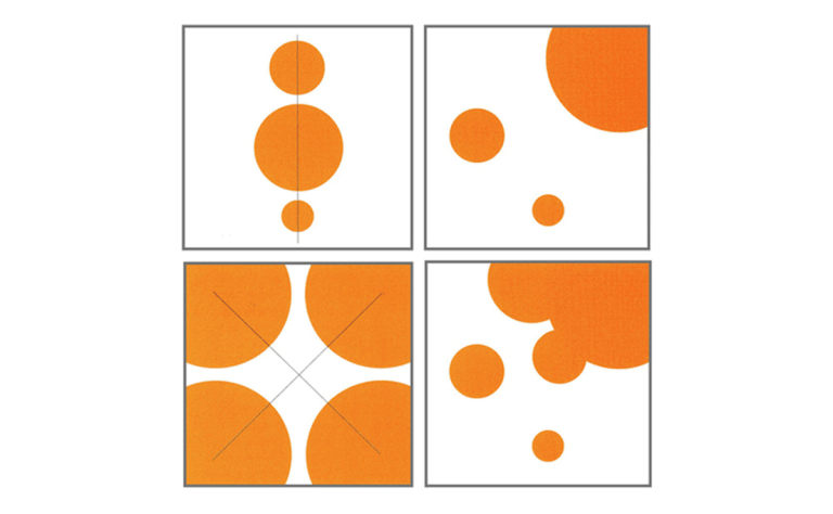
Lines in graphic design are divided into 4, namely: vertical, horizontal, diagonal, and curves. In graphic design work, lines are used to separate positions between other graphic elements on the page. In addition, it can be used as a pointer to certain parts with the aim of being an explanation to the reader. In the context of tabloids, for example, we can use a line to separate the name of the rubric from the news. In a diagram of God as Alpha and Omega and the process leading to it, for example, we can provide a line indicating the direction in which this process occurs and as a guide for directing eye movements.
Lines are also used to separate two different parts of a publication or to give emphasis.
Form
Obviously Sony Kartika shape is an area that occurs because it is limited by a contour (line) and/or limited by the presence of different colors or by dark light in the shading or because of the texture. The form can be a natural form (figure), which does not at all resemble a natural form (non-figure). Form has a change of form in the form of stylization, distortion, and transformation. This meaning is constructed in two-dimensional graphics. Commonly also called area. Meanwhile, in 3-dimensional graphics, shape is defined as mass.
Room
Kusmiati in the Basic Theory of Visual Communication Design, explains that space occurs because of the perception of depth so that it feels far and near, high and low, visible through the sense of sight. This element in the practice of newspaper graphic design, for example, is used as an element of breathing space for the reader’s eyes. This is intended so as not to get too tired reading texts that are too long. And the blank space provides an affirmation of the separator between columns of newspaper text. In addition, it gives the impression of a roomy and neat design. This is termed white space (empty space). Empty space means the absence of text or images. Completely empty, and not that a wasted and wasted place, not at all. That blank space is the language of your design.
Texture
Texture is a visual element that shows the feeling of the surface of the material (material), which is deliberately made and presented in an arrangement to achieve a visual form, either in real or pseudo form. For example, the impression of the texture of wood, fur or glass. Meanwhile, according to Kusmiati, texture is the physical nature and quality of the surface of a material (material), such as rough, shiny, faded, dull, which can be applied in contrast and harmoniously.
Color
Color is caused by differences in the quality of light reflected or emitted by objects. When we see color, we actually see light waves reflected or emitted by the object we are looking at. (Wartmann, 2004).
Just like shape, color gives the impression of a more profound message. The color red, for example, suggests enthusiasm, excitement, and the heat of fire. Or the purple color suggests pale, wilted and unenthusiastic. The combination of colors gives a varied visual impression which of course has an impact on your graphic design work. As graphic design expert David Dabner explains in Design and Layout: Understanding and Using Graphics, the colors you choose have a tremendous effect on how your design feels and how people respond to it (feedback). While an object looks shining because it reflects light to the eye. An object will appear transparent because light penetrates its surface, hits the object behind it and is reflected back to the surface.