The main essence of the website interface is to help visitors find information practically, easily and in a relatively fast time. Of course, it is not surprising that the appearance and interface of the website is very important, but the most important part of the interface is to provide the best experience for website visitors.
Best website design
Many web designers invest months of their time in developing the best interface and website design. If you’re looking for examples or references, here are some websites with the best designs and interfaces.

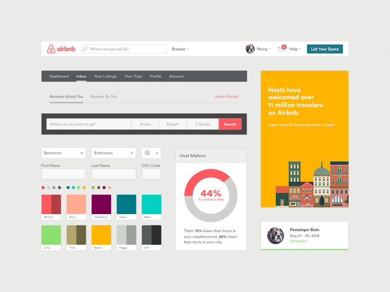
Airbnb may not have a very impressive website, but they can create a website design that makes the booking process a lot easier. The whole process is made very effective and efficient so that it saves visitors time. Visitors will be immediately guided by the slogan “Where to? Start your next adventure on Airbnb.” and can immediately start the booking process via the “Check in” box below.
Medium has a website design that utilizes color very well, so visitors can know the difference between each content from the color. As a blogging platform, Medium has chosen typography that fits perfectly and is comfortable for visitors. Each line and box is very evocative of visitors to write, browse and share.
Defringe is an online gallery dedicated as a repository of artwork or other creative content on the internet. For navigation purposes, this website uses a menu on the left which is similar to music software. This is certainly very easy for visitors to explore the website further.
FS Emeric is a rather futuristic website. This website design uses scrolling navigation on the left side, plus a special font design on the right.
Boostedboards are purposely made to focus more on the product than on the UI aspect. Each page is decorated with high-resolution photos of the skater and arranged in such a way to keep it looking attractive. Boostedboards provides a good example of web design utilizing photos.
Feeds not only have an interesting concept but also a stunning website display, which makes visitors can’t stop thinking. With a combination of animation and video, this website makes visitors immersed in a different browsing experience. As an unusual website, Feed has several unique features, such as navigation which also functions as a progress bar.
ETQ is an e-commerce website that uses a minimalist approach to its design. They take advantage of attractive product photos as the main attraction from the visual aspect. The designs applied tend to be simple, flat, color-based backgrounds and combined with strong typography. All of these combinations in the design of the ETQ website keep visitors focused on their main goal: buying shoes.
Mikiya is a Product Designer who has a portfolio with a minimalistic concept to showcase his work with photography and animation. Mikiya’s website was created in Japanese and then translated into English, to help demonstrate his design skills internationally.
9. The History of Climate Change
Follow in the footsteps of Luc Jacquet who provides education about Earth’s climate change in the form of website visualization. The combination of media & historical content as well as unique animation is able to describe the story very interestingly.
While other airline websites are usually haunted with User Interface problems, Virgin America is just the opposite. This website tries to present the best User Interface ever, starting from the aspects of Usability, Accessibility to Responsive Design. In fact Virgin America has been named the first truly Responsive airline website, a breakthrough in the industry.
The need for digital IT is needed in daily activities, Bead IT Consultant is the right choice as your partner, visit our website by clicking this link: www.beadgroup.com

