In the world of graphic design, there are rules and procedures that you should follow in making the work so that the results obtained can be maximized. Not just about making visually interesting, but how for the purpose of making your entry can be up to the audience well. One of the most important parts of a work of graphic design is the color.
As the essential element for visual works, there are some important things that should be considered in selecting, placing, and combine the colors in any design. Well, this time we have rules guide the use of color to graphic design that is ready to help you create the work of a higher quality. Listen carefully well!
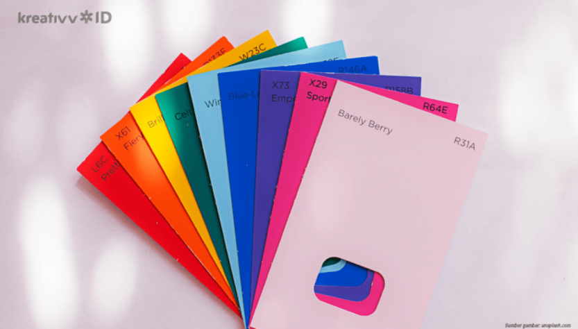
1.Master Diagram Color
Do you remember the lesson in art at school first? Well, the basic thing that’ve always been taught the first time the course is about the color. Surely you’re familiar with the term primary color, secondary, and tertiary dong. The three primary colors are red, yellow, and blue. The combination of these three colors which then creates a complex secondary colors, namely green, purple, and orange, as well as twelve tertiary colors.
A combination of all the colors primary, secondary, and tertiary forms a diagram of the color circle or color wheel. The rules of the use of color is the most fundamental course begins by studying the system color wheel. From this system, the colors are grouped into two types based on tendency of the temperature, i.e. warm and cold.
2. Play with Color Undertone
Still about the color wheel, the aspect is no less crucial to note is about the color undertone. Try to notice the picture color wheel above carefully. In the diagram, the distribution of colors for plain split between a cool tone and warm tone. Each is divided in six different colors. Each primary color has undertone or the color of the “hidden” that appears behind the color.
To use a combination of the color red for example, you can use complementary colors which have undertone of the same, for example the gray with the color undertone of red. These rules are created based on the temperature that exists in every color. Group warm color usually has the undertone of red and blue colors for a cool tone. Although there is also a shade of blue color such as purple which have undertone warm.
3.Understand The Psychology Of Color
Do you know if each color can give the impression of different things? For example, the color red, yellow, and orange that are often used in the restaurant for fishing hunger and appetite of the customers. While green, blue, and white was chosen for a variety of fields in medical industry because it can give the impression of a clean, hygienic, natural, and calm.
Well a variety of different perspectives is then used as a benchmark in the rules of the use of color in the manufacture of a work of graphic design. The goal of that work is appropriate and well received by the target audience. Moreover, if the works are deliberately made for commercial purposes, such as for the purposes of advertising or content selling.
Needs to be digital IT is needed in the day to day activities, Bead IT Consultant is the right choice as your partner,visit our website by click this link : www.beadgrup.com