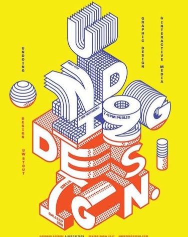
Promoting a business or event would not be complete without spreading posters to the general public, both offline and online. Posters are considered as a powerful medium to attract the attention of customers.
When it comes to the design process, it’s important to be creative, but you also have to keep the information as effective as possible to a wide audience. For that, here we want to share 6 tips on how to make posters for those of you who want to learn to design. Let’s see starting from the first tip!
- Easy to Read from a Distance
While walking in a shopping center, your eyes unconsciously focus on the poster hanging in front of the music store. This means that the poster designer has succeeded in making an attractive poster. written on the poster. If so, it will be more effective, right?
There are two most important pieces of text in a poster design as a differentiator, namely:
The title is the main text element and is the largest in size. Use fonts that are attractive but still easy to read to attract attention.
Details, this section is the details of the event listed in the poster, such as information on time and place. Write information briefly, don’t forget to use contrasting colors as a differentiator.
- Pay attention to the white space
White space or negative space is the empty space between and around elements of a layout or page design. Maybe, using too much distance between elements feels weird, but dramatically far apart can provide a cool visual, GenK.
In addition to good visuals, providing white space is the right way to make a poster if you want to create a poster design that is easy to read from afar. There are several places that are suitable to be given white space, namely:
Between each letter
Located between lines of text
Between different types of elements, such as images and text
Around the canvas margin
- Typography as a Point of Interest
Not infrequently various forms of beautiful typography adorn a poster. Even some of the best posters are made solely by relying on fonts and colors without pictures or illustrations, GenK. In order to better understand about the type of font, you should first refer to the information in the article that we have published before.
If so, now follow one of the following ways to make posters, which is to play typographic designs as a point of interest. Use typefaces that are bolder in shape, large in size, and in contrasting colors. Then just align it with the poster design theme that you want to build.
- Resize and Layout
The next way to create a poster is to consider a design that can be resized and can be re-layouted. For example, the movie poster you see in the cinema, then there is also on Instagram, and there is also in the Facebook header. The design remains the same, but what sets it apart is the size and layout of the design elements.
- Stand Out
Competing with other poster designs makes you have to be creative to create posters that stand out from other designs around it. Make it visually spectacular. So when people walk past your poster, they get focused and choose to keep reading the content until the end.
Creative poster design is a design that can convey a message to the general public by creating a unique poster. Starting from the use of color, typography, images, and all the elements listed must stand out. There are also other factors such as readability and poster scalability that you should consider, GenK.
The need for digital IT is needed in daily activities, Bead IT Consultant is the right choice as your partner, visit our website by clicking this link: www.beadgroup.com

